Wednesday, 13 November 2013

How to draw an ear

How to draw a human ear

An ear is in fact an easy thing to draw.  The trick is to get the shape and proportion right.  You are halfway there once this is done.  The rest is in the detail.

The most common mistake beginners make is to neglect the dark shadows in the ear and then what you get is a flat ear with no dimension.  An ear still has folds and creases and you need to show this in your drawing.  Remember that who ever looks at your drawing should immediately recognize what you want to portray without you having to tell them.
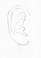
Outline of an ear
In this tutorial I am going to show you how to draw an ear with ease in a few basic steps.  Don't worry if you don't get it right the first time, as with everything in life: practice makes perfect.

Step 1:  Basic shapes

I always start off a drawing by defining the basic shapes found in the object.  An ear can be drawn with a big circle and a small circle.  Connect these circles to form the basic shape of an ear.

Shading of an earStep 2:  Add more detailed lines

Now that you have the basic outline shape of your ear, you can add some more detailed lines.  I draw these lines a bit lighter.  The reason I do that is so that when I start shading, I want the shading to look real and natural.  You can rather make these lines darker by the use of shading later on.
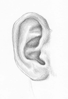
Drawing of an earStep 3:  Add light shading to areas that must appear darker later on.  Gradually make them darker by use of layers

Start adding some light shading to the areas of the ear that are deeper into the drawing or further away.  This will help you to avoid making mistakes.  Don't start too dark, you will regret it later.  Rather start light and work your way towards darker shades by working in 'layers'.

Drawing of an earStep 4:  Add final touches and finish off

Add some more light shading to all the areas that are closer to you or that you want to appear in front of the darker areas.  Remember that an ear is not a flat object so please remember to have some light values, grey values and black values in your drawing.

Hope that you found this step by step guide to drawing an ear useful.


Thursday, 16 May 2013

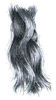
Learn how to draw realistic hair

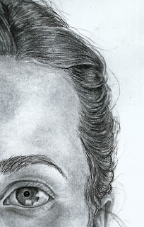
Charcoal drawing of hair and eye

How to draw realistic looking hair with charcoal in a few easy steps

In this tutorial I will show you how you can use some easy tricks to draw realistic looking hair.  Drawing realistic hair is not as hard as you thought if you know what to look for on your subjects hair and how to go about.

Tools you need for a charcoal drawing

charcoal drawing of hair
figure 1
The first thing you need to know when you want to learn how to draw hair with charcoal is the things you will need.  You will need some willow charcoal, compressed charcoal, smudge tools, a rubber eraser with sharp corners and a putty eraser.  All these tools are best used together when drawing in charcoal for great results.

willow charcoal
Figure 2

How to draw wavy hair with charcoal

Step: Undertone

When you want to draw hair you will start of by using a piece of willow charcoal flat on its side and rub it over the area of the drawing where you want to draw the hair (see figure 2).  You can then use a smudge tool to smudge the area and cover it with a base layer.  If the subject is blonde, don't make it too dark.  

You can look at the effect of light on the hair to see where your highlights will go.  These highlights give the effect of healthy, clean and shiny hair.  You can leave these parts a bit lighter than the rest of the hair area.  See in figure 1 the lighter areas or highlights that give the hair a natural, 3D look.  

charcoal drawing of hair
Figure 3

Step 2: Add some detail

Use a compressed charcoal to add detail.  It is best to use a nice and sharp compressed charcoal.  Use free flowing lines to add the necessary detail of gestural individual hair.  By gestural, I mean you don't have to draw every single hair, just a few to suggest a whole bunch.

Look at figure 3.  You will see that the compressed charcoal alone added a lot of detail before you have really added detail.  In figure 3 you will also see that the areas I left a bit lighter, now add some volume and this is before using an eraser.  I always do this because sometimes I want some areas to be almost white so the hair looks like it is really reflecting a light.  This white is, believe it or not, the thing that can easily add that extra definition you need.

Figure 4

Step 3: Create some highlights

Use a rubber eraser to erase some extra highlights and to make white areas that suggest shiny hair.  Don't erase the area in such a way that it looks like a block.  You can erase the are with some sharp points to make it look natural.  

drawing of hair
Wavy hair
After erasing with a rubber eraser you can use a sharp compressed charcoal to make fine lines in the erased area.  This adds to the realistic texture of the drawing of the hair.

Step 4: Finishing your drawing

Make some areas darker where needed so they can fall back more or to imply the color of the hair.  Add some single fly-away hairs here and there because face it, no one has perfect hair.  You are done!

I hope this was somewhat helpful and that you will be able to draw hair like a master. 

Tuesday, 14 May 2013

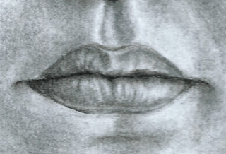
How to draw a mouth

how to draw a mouthLearn how to draw a mouth step-by-step in charcoal, for beginners too!

A person's mouth can be very characteristic.  It is something that is used to speak and show expressions.  A mouth can be a very easy thing to draw or a very hard thing to draw.  In this tutorial I will show you my approach on how to draw a mouth.

how to draw a mouth: parting lineStep 1:  Draw the lip parting line

You can start of with willow charcoal, which is a bit softer and more forgiving if you make mistakes.  I started with compressed charcoal because I am going to make this line darker later on.  The first thing I draw when I draw a mouth is the line that parts the two lips.  This will just give you a basic indication for the width of the mouth.  You can shape and draw the rest of the lines around it.  This line should be a bit squiggly.  No ones parting line is completely straight.  Note that in the corners of any mouth, the line will either go a little up or a slight curve down.  In this case the corners of the mouth I am drawing is curving slightly up and then down.

Step 2:  Draw the shape of the mouth

The next thing I do when drawing a mouth is to draw the shape of the upper and the lower lip.  The lower lip is most of the times a bit thicker than the upper lip.  The upper lip forms a wide 'M'.  The little 'v' is in the middle of the mouth and the legs of the 'M' come down close to the corners faster than the bottom lip.  In other words the lower lip should be a bit wider than the upper lip.  Don't make these lines too dark because you don't want a too dark lip-line later on.

how to draw a mouth: basic shadingStep 3:  Add the basic shading

Use willow charcoal and give both the upper and lower lip a basic tone.  You can then use a smudge tool to soften the appearance and for a more natural texture.  Depending on your light source, the upper lip might be a bit darker if the light is from above the subject.  The area close to the mouth opening can be a bit darker because less light reaches this area.  It is important to remember that the mouth is not flat and still takes up volume.  So try to point out the areas where the light reaches the most and where it reaches less.  The areas where it reaches less will fall back in the drawing and the areas where it reaches most should pop out of the drawing.

Step 4:  Drawing in some highlights with an eraser

Use a rubber eraser to get sharp highlights and a putty eraser to make certain areas lighter with a more gentle touch.  This should already add some detail to the drawing.  Do this step before you add darker tones and detail.

Step 5:  Add more detail with a sharp willow

Use some sharp willow charcoal to add more detail on the places you want to add detail lines with charcoal later.  This is also the step where you add enough willow to create volume on the lips.

Step 6:  Smudge some of the willow and add detail with a compressed charcoal

This is the final step an d this is when you add detail with a sharp compressed charcoal.  Use a smudge tool to smudge some of the willow charcoal from the previous step.  Make the line between the lips darker to create the illusion of the lips being able to sepperate.  Then use a very sharp compressed charcoal to add light lines.  This will give the mouth some texture.  Use an eraser or putty eraser where necessary to add highlights.  And you are done!

I hope you enjoyed this tutorial and that you will impliment some of these tips and techniques in your drawings.

Monday, 13 May 2013

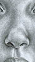
How to draw: a nose

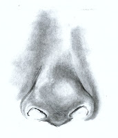
Drawing of a noseLearn how to draw a nose 

In this tutorial, is my approach to drawing noses and I find it to work great for me.  I hope you can use some of these tips when you draw noses in your drawings.

In this tutorial I will teach you how to draw a nose.   I always use to dread drawing the nose and postpone it while I was drawing.  I use to struggle with getting it to look right and I use to struggle to get it to look like it is 3D.  I have practiced it a lot since and have studied noses a lot because I wanted to like drawing noses and not hate it. 

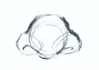
basic shapes of a noseStep 1: Basic shapes of the nose

I usually start with the basics of the nose by drawing the geometric shapes it consists out of.  The most basic shape of the nose is a circle with two little circles on both sides.  I prefer drawing those small circles on the side of the nose a little bit triangular.  This will help me later on when I draw detail.

shape of a noseStep 2:  Draw the shape of the nose and the nostrils. 

I draw a bit more detail over my basic shapes by creating the outline.  I draw the nostrils in both those small triangular circles.  Take note that nostrils are not completely half circles but have a little bit of a triangular shape.
Charcoal drawing of a nose with basic shading 

Step 3:  Start adding a base color or value 

I start adding some base values.  I add some basic shading to the areas I want to fall back more.  I leave other areas white that I want to come forward out of the drawing.  This will create some illusion of depth.

Charcoal drawing of a noseStep 4:  Continue adding shading 

I continue to add some shading in layers until I am satisfied.  I use and eraser or putty eraser to erase areas I accidentally made a bit to dark and to add highlights.  I have also made some mistakes here and there and I also fix them with the putty eraser.  I use some compressed charcoal to add those darker lines around the nose and then ad some more shading with the willow.  Pay attention to your light source to see where the light hits the nose and where not.

charcoal drawing of a noseStep 5:  Shading the nostrils and adding detail. 

Now that I have my shading almost done, I can start with some extra detail.  I use my compressed charcoal and a little bit willow charcoal for the nostrils.  The nostrils are very easy to add detail to.  It is a hole and falls back the most so it should be darker than most of the shades currently in the drawing. 


So this is how I draw my noses.  I hope you like it and that you learnt something new.

Friday, 10 May 2013

How to draw a portrait or face

Pastel portrait drawingHow to draw a portrait by studying the human face and proportions. 

I will give you some tips regarding how to draw a portrait by using a step-by-step measuring guide.  There are certain elements of the human face that can be used as guidelines when drawing portraits.

Different shapes for faces
Different face shapes


1.  Shape of the face

You should study and learn about the shape of the human face.  There are different shapes of faces for example; square, heart, oval, round, oblong and diamond.  The first thing you need to determine when you want to draw a portrait is which shape face your subject has and then draw that first.  The rest of the elements all follow. 

2.  The eyes

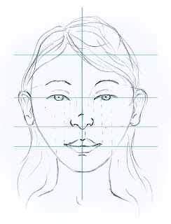
The face should be divided into four; one line vertically and the other horizontally.  The eyes go into the middle of the face on the horizontal line (I usually measure it so the line goes through the pupils).  One eye can fit into the width of the human face five times.  When you have drawn the shape of the face, there should be enough space for one eye to fit in between the eyes.  There should also be enough space for one eye to fit into each of the temple areas next to the eyes.  

The iris is in the middle of the eye and the pupil is in the middle of the iris.  The eyebrows will need to be drawn according to the expression of the subject but in most cases another eye should almost be able to fit in between the eye and eyebrow.  Learn how to draw eyes
Drawing of face with proportion measures
Figure 1

3.  The nose

The face is further divided into two between the half line where the eyes go and the bottom of the chin.  On this line is where the nose will go.  I measure it on the tip of the nose.  The width of the nose can be measured by drawing two imaginary lines from the inner part of the eyes down to the nose.  Learn how to draw a nose

4.  The mouth

The face is then further divided into two between the nose line and the chin and this line forms the line where the mouth goes.  Depending on the shape of your subjects face, whether it be long or round, the mouth may be a little above, - below or on the line.  The sides of the mouth can be measured by drawing an imaginary line from the inner part of both the irises down to the mouth. (see figure 1 for further details)  Learn how to draw a mouth

5.  The ears

The ears can be measured in line with the eyebrow's natural curve or with the top lid of the eye down to the tip of the nose.

6.  Neck

The width of the neck is measured in line with the outside lines of the irises.

7.  The hairline

The area above the eyes should be divided in two and a little above the top half is where most hairlines normally start.  But bare in mind that some people have a low hairline while others have a high hairline.  Learn how to draw hair

I hope you will use this guide when you draw portraits in the future and that you will find it useful. i found it extremely useful to know this because I have tested it and these calculations apply to everyone.

Thursday, 9 May 2013

How to draw with different mediums

Learn about different mediums in drawing

In this post I am going to talk a bit more about different drawing mediums.  

By learning about different drawing mediums, you also develop your style.  It is good for an artist to have at least a basic knowledge of all the available mediums out there.  As you experiment with different mediums, you will find out what you like and you might decide you only like one medium and don't want to use any of the rest, that's fine.  That's how you develop your style.  You need to know what you like and what you don't.  

Most beginners never learnt about any other medium but pencil and are stuck in the mindset that pencil is their favorite medium.  I encourage you to have a look at all the mediums I am going to discuss and just try it, you will be surprised that you might like something that you never thought you will.
I am going to discuss five drawing mediums:
  1. Pencil
  2. Graphite
  3. Charcoal
  4. Pen and Ink
  5. Brushes and Ink

Pencil tonal spectrum1.  Pencil

Pencil is the most universal medium and is also a very easy medium to use.  It varies from hard to soft (2H, H, HB, 2B, 4B, 6B etc.), black and varied thickness.  The harder the lead (H, 2H etc.), the lighter the tone delivered.  The softer the lead (2B, 4B etc.), the darker the tone it produces.  Pencil is a medium that is very precise and can be used loosely.  When you draw with pencil you want to use a combination of hard and soft pencils and a varying degree of blackness.  For example, the most commonly used combination of pencils in a drawing is HB (the light tone), 2B (the mid tone and also the most versatile pencil) and a 4B or 6B (the dark or black tone).

Graphite marks2.  Graphite

Graphite is a bit more versatile than pencil and comes in a wooden casing or as a solid stick with a plastic covering around it.  The solid stick of graphite lasts longer because it is more solid and thicker.  You can use the solid stick to draw thick lines or thin lines and also comes in very handy when shading a drawing.  The wooden casing might feel a bit nicer to draw with.  Graphite also varies from hard to very soft and different tones of blackness.

3.  Charcoal

Charcoal marks
Charcoal is my personal favorite medium because of the contrast it creates and also because I find it to be very versatile.  There are different types of charcoal namely compressed charcoal, compressed charcoal sticks and willow charcoal.  Compressed charcoal can be found with a wooden casing, with a plastic covering or as sticks.  It is also mostly used to add finer details into drawings because it can give more refined an precise lines.  Compressed charcoal is used with willow charcoal, which are light sticks that come in varied thickness.  Willow charcoal is excellent for laying down a "base coat" on the drawing surface and to create different tones in the drawing but should always be used with compressed charcoal.  Charcoal is a messier medium and can be used with smudge tools or your fingers to smudge the willow charcoal for shading. A charcoal drawing must also be fixed with a fixative (you can use a colorless hairspray as well) or it can be placed interleaved pieces of paper while transporting your drawing. 

4.  Pen and Ink

You can use push-pens, dip-nibs or fine liners to draw with.  This is a good medium to use with ink to add finer detail to a drawing but can also be used completely on its own.  A dip-nib does not have an ink cartridge and should be used with drawing in, most commonly 'Indian ink' and can be water soluble or permanent.

5. Brushes and Ink

Brushes can be used for washes of tone so I often use it with water soluble or permanent 'Indian ink'.  When you use ink as a wash, remember to dilute the ink with water to get lighter tones.  Start your drawing with very light tones (very diluted ink) and work your way up like with layers by slowly diluting it less until you achieve the tones you want.  

I normally carry a few different brushes with me namely numbers 0/2, 2, 1, 2 and a 6; all of them round and then one flat 6.  I find these brushes make a good mark and are all useful in any ink drawing.

I hope that you will be open to experimenting with all of these drawing mediums before you decide to only stick to one specific medium.  As you play around with different drawing mediums, you will enrich your knowledge of drawing styles and techniques.  I hope that as you learn about these mediums while drawing with them, that you will also learn to control them.

Tuesday, 7 May 2013

How to draw eyes

How to draw realistic eyes

In this post I will discuss a step by step tutorial on how I draw eyes.  

I believe that in order to draw realistic eyes, they need to look alive.  Eyes are wet and have a shiny texture.  Eyes are also white and people sometimes tend to forget that.  In essence, in order to get the eyes to look real and alive, you need them to appear white and also have a wet texture.

Drawing of an eye on tea wash paper
Figure 1
When I first started out drawing portrait, I had a basic understanding of eyes.  But like most people, my brain couldn't completely work out how I was going to do it.  After a lot of observation and trial and error, I found an easy way to add detail that looks incredible but aren't complicated at all.

Shape of an eye

All the elements of drawing still apply when you want to draw an eye.  But what I have noticed is that an eye needs some extra attention when it comes to shape.  Everyone is unique and so is the shape of his or her eyes.  Some people have big eyes while others have small eyes.  There are people who have "cat eyes" and some that have round eyes.  One must always remember that no one's eyes are the same.  When you are drawing the shape of the eyes, you must also consider the facial expression.  If the facial expression happy or laughing, less of the iris will show and there will be laugh lines near the temple.  In figure 1, the expression in the eye is awake and more alert.

In this tutorial on how to draw eyes, I am going to focus on one eye and it's details.  I normally just repeat everything on the other eye.  I am drawing with willow charcoal, compressed charcoal, a putty eraser, a rubber eraser and smudge tools.
step 1 of drawing an eye
Figure 2

Step 1

An eyeball is round and the soft skin and hair, all form around it.  The first thing I start with when I draw an eye is the eyeball and then I start with the shape of the eye (see figure 2). I start of with willow charcoal.  Willow charcoal is softer and less permanent than compressed charcoal.  It is also a nice medium for shading.
step 2 of drawing an eye
Figure 3

Step 2

The next thing I do is draw the iris and pupil.  I then draw the eyelid above and under the eye.  The next thing I do is ad the eyebrow.  I fill in smaller details like spaces I want to keep white.  The reason for this is because these spaces that are left completely white, will pop out and make the eye look 3D and also gives it a glossy texture.  If you forget to leave those areas white, you can always use an eraser to reverse it, but bear in mind it might not be as white so try to always mark the places you want to leave white (see figure 3).
step 3 of drawing an eye
Figure 4

Step 3

In my next step, I do a basic under tone for my drawing with willow charcoal.  I smudge the charcoal to get a nice and even tone and then add more charcoal where needed until I am satisfied.  This helps so when I add my detail, I can just add over it in another layer.  But some spots will go darker and some might go lighter, depending on the detail I add later on.  This is my first step to creating volume and shading. 
step 4 of drawing an eye
Figure 5

Step 4

I then add some detail on the skin and eyebrows with my compressed charcoal (I always leave the delicate eyeball area for last).  Compressed charcoal is a hard type of charcoal that gives you more permanent lines.  It is also darker than willow charcoal and can be treated like a pencil.  I sometimes charcoal to add darker tones over the willow charcoal.  I find that it works nicely for me. 

Step 5

step 5 of drawing an eye
Figure 6
After I have added some detail to the areas surrounding the eyeball, I can start with the fun part.  Doing the eye ball and the iris.  I use my smudge tool that is a bit dirty by the end of the sketch to add the volume to the white area.  Remember to leave those marked spots white.

I use my compressed charcoal to add the detail in the iris.  Make sure your charcoal is nice and sharp, this way you can get darker and more defined lines for detail. 


Drawing of an eye
Figure 7

Step 6

To finish off the drawing, I add the lashes.  Even though I have drawn a man's eye, he still has lashes.  Pay attention to the shadow they cast over the eyeball.  Use a sharp compressed charcoal to add the lashes and a dirty smudge tool to add the shadow.  

And there you have the final sketch.  I hope you enjoyed the tutorial and that you use the tips I gave you.


View page

Wednesday, 1 May 2013

How to draw with different rendering techniques

Explore with 4 different rendering techniques

I will discuss four different techniques you can use to make and interesting object or to help you loosen up and think outside of the box.

The first thing you can do is to create a tonal value strip on a separate piece of paper of each of these techniques.  This will help you get a hang of using them and to practise going from dark to light on the tonal spectrum.

The four techniques I will be discussing are smooth, scribble, hatching and cross-hatching and pointillism.  I hope that after you read this that you will find new inspiration to use these techniques in your drawings.
Crushed cup
Smooth

Smooth

Smooth rendering is the most commonly used technique of rendering.  You can use the flat side of your pencil tip for smooth shading.  You can vary your pressure to achieve a wider spectrum from dark to light.  Combine it with using the tip of your pencil to achieve a darker tone to add detail and texture.
Pointillism cup
Pointillism

Pointillism

I use pointillism when I draw with pen and ink.  But is found widely across the field of art.  It can be used when painting and also with pencil.  It is the technique of using dots close to each other for darker tones and then dots further away from each other for lighter tones.  In painting it is the art of using different colors of short strokes next to each other and when viewed from a distance, an image becomes clear.
Hatch rendering
Hatching & Cross-hatching

Hatching & cross-hatching

Hatching is the use of lines going in the same direction (directional lines).  The denser they are, the darker the tones and the further away from each other, the lighter the tones.  You can also vary the pressure of your pencil to achieve lighter or darker tones.  

Cross-hatching is the same as hatching and it is the use vertical lines with overlapping horizontal lines.  (They are also directional, but they cross each other)
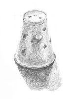
Cup with holes in
Scribble

Scribble

Scribble is literally scribbling like you did when you were a child.  The best way to go about when scribbling is to keep you wrist relaxed.  You can experiment with the angle at which you are holding your pencil to achieve a different mark as you draw.  Vary the pressure at which you draw and you can overlap your scribbles to get a nice tonal spectrum in your drawing.  Scribble is a great rendering technique for textured objects like the surface or a carpet or tennis ball.

Some of these rendering techniques might sound strange but they work great when you want to apply texture and they are also fun to do.  I recommend that you try all these techniques and most of all enjoy while you are doing it.

View page

How to draw a composition

How to draw a striking composition in 10 easy steps

What is a composition?  A composition refers to the basic format in which you arrange, organize and combine your objects within the border of your drawing space.

Charcoal drawingA strong composition can be very intangible.  If the composition of a drawing is done well, it can give the audience a certain feeling, convey a certain mood and tell a specific story.  It isn't the center of attention and can pass by almost unnoticed.  But if a composition is done badly for example all the objects are place in the middle, it can feel awkward to the viewer.  As you practice these 10 tips or important elements, it will become a natural instinct to use them and you will be creating perfect compositions like a master.

1.  The focal point

How do you choose a focal point to draw?  The focal point is the primary interest in your drawing or the object you can use as the focus.  It is crucial to pick a good subject for your drawing.  Pick something that is visually interesting with nice negative spaces and some detail.  Make sure you have a good light source from one direction.  Use the rule of thirds to place your focal point in on an interesting spot that will draw the viewer’s eye to it.  Then check the other elements in your drawing to see if that spot works for your focal point, otherwise you should play around with it more.

2.  Use a viewfinder

Use a viewfinder to isolate your key elements in a scene and check their placement.  You can use this little handy tool to create your own-cropped scene.  Sometimes an artist doesn’t realize the powerfulness of the four lines created by the edge of the canvas or paper.  You can cut your page to the correct width and height for enhanced practicality.  Think about the shape of this paper or canvas before starting a drawing.  For example if you want to draw a skyscraper, you might want to draw on a rectangle shaped page.

3.  Make use of navigational tools 

You can use lines as navigational elements in your drawing that lead the viewers eye to different elements in the drawing.  For example you can draw a piece of string as a secondary element that enters from outside the frame and leads to your focal point.  This piece of string functions as a navigational tool.

4.  Ensure you have enough contrast and varied tonal values

Your drawing consists out of dark and light tones but ensure that you use the whole tonal spectrum.  Use strong contrasts between white and black and then grey tones in between.  You want your values to be quite different from each other in different amounts.  You can try the "two thirds, one third and a little bit" rule.  As an example you can use two thirds in dark tones, one-third light tones and a small area or object that is a mid-tone.

5.  How many elements should you have in your composition?

Use odd numbers rather than even numbers.

6.  Use negative space between elements or objects

Positive space is any object or form that stands out from the background and the eye can register as being something.  The negative space is the space around the objects or the background.  In other words the negative space is all the space not taken up by important objects, focal point or other areas of interest.  
It is often suggested to use equal amounts of positive and negative space in a drawing.  If there is too much positive space, it can become too crowded.  On the other hand if there is too much negative space, it can become empty and lonely.  The negative space thus contributes to the feeling you would like to convey or to draw the eye to a specific element.  For example, you can use more negative space if you want to focus more attention on a specific element.

7.  No kissing of elements

Kissing in this context means for the elements to touch.  They must either be definitely apart or definitely overlapping.  Overlapping separates your drawing area into a foreground, middle ground and then a background.  Kissing just creates a weak connected shape and can distract the viewer’s eye and causing them to pause so they can puzzle it out.  Overlapping is a great technique to create distance and depth in your artwork.

8.  Balance and proportion

If you center your subjects horizontally and vertically, you can achieve a great sense of balance but it is expected by the viewer and can end up being a bit boring.  Balance is a stable arrangement of subjects in a composition.  You can achieve balance through varying your proportions, spaces between objects; vary the angles they lie at and their sizes.  This will make the drawing much more interesting.

9.  Unity

The elements in your drawing should somehow relate to each other.  Otherwise they just look like a bunch of stuff throw together.

10.  Variety in composition layout

Don't be scared to experiment with different composition layouts.  Don't get stuck in doing the same kind of composition layout every time.  You can vary where you put your horizon line, the focal point or swap between landscape and portrait format.

If you implement these 10 rules of composition in your artwork, you will instantly see a difference in the effectiveness of your artwork.  Eventually as you practice and experiment they will come to you naturally with no effort.

View page

Tuesday, 30 April 2013

Draw using negative shapes

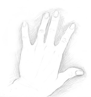
line drawing of hand
The hand is positive space and the rest negative space


Looking at the negative spaces

In this section I will explain to you why learning how to draw with negative spaces are very important to your drawing. 

An object is an example of a positive space, in other words it is a solid.  The spaces between your objects and all the solids can create very interesting negative shapes and this is called the negative space of your drawing.

Negative spaces play an important role in your drawing because they enable you to check how accurate your drawing is.  They also contribute to your composition.  When you make a compositional drawing you will see that negative spaces play a very important role to the space in your drawing.  The more unique your negative spaces are, the more interesting your drawing will become. 

How to prepare good negative spaces for your drawing

In a figure drawing, it is important for your model to give you enough negative space to make the drawing interesting.  This can be achieved for example, by the model standing with one leg straight and the other bent and with one hand holding a pole and the other hand on the hip. All these negative spaces create interesting lines on your figure and makes the audience want to explore the drawing.  If there is little negative space, for example the model stands with their arms next to their side and legs next to each other, the drawing can become boring or feel uncomfortable. 

The role of negative spaces in a composition

Negative spaces can be used in a composition to get balance in a drawing.  The rule is to usually have an even number of positive and negative spaces.  The negative can be a tool to create a certain mood in a drawing.  A busy drawing with little negative space and a lot of positive space can be over crowded but this might be your intent.  This can draw more attention to the positive space.  A drawing with less positive space and more negative space can feel empty and lonely.  It is up to you to decide how your drawing feels.  It is important to choose your balance just right for your subject matter and the style of your drawing.

How to test the forms in your drawing with negative space

When you put three balls next to each other to form a little triangle you get a funny triangle negative space.  When one of the three sides of the negative space  triangle is not correct and the triangle is misshapen, you know that one of the three balls is drawn wrong.  This is a way in which we can use negative spaces to test whether we have drawn our forms correctly.  If the triangle is right, you know that your forms are also right. 

Negative space is very useful in a drawing and I use it a lot in deciding how to place my objects.  It helps me to decide whether a certain object will look interesting or not in a drawing.  I also look at the relation and proportion of the negative space lines to help shape my positive space.  Negative space is a great tool that every artist should learn to look at before, during and after a drawing.

How to draw with perspective

Mastering One point and Two point Perspective

Perspective in drawing
Figure 1

I am going to discuss the use of one-point and two-point perspective in drawings and how you can effectively pull of a perspective drawing with absolute ease.  

In art we commonly use one, two and three point perspective but I will only discuss the first two and at a later stage I will introduce three-point perspective.  The first requirement in perspective is that there must always be a horizon line.  All your perspective points should always meet the horizon line.  In one-point perspective there is only one perspective point on that line while in two-point perspective there will be two perspective points on the horizon line (see figure 1).

When it comes to perspective in a drawing there are three main aspects that should be considered.  

First is how the size of an object seems to diminish as it moves further away from the human eye and closer to the horizon line.  

The second thing is how aerial perspective comes to play.  Aerial perspective is the impact of atmospheric light on an object as it moves further away from the eye.  For example, when you are close to mountains you can see the beautiful brown colors of the ground and greens on wild flora but as you move further and further away from them, the mountains become almost blue.  That blue is the atmospheric light or the aerial perspective.

The third thing is that objects that are further away from you or closer to the vanishing point don't need as much detail as the objects closer to you.  Your eye naturally sees less detail the further away it is from an object.  This concept can be used in drawings as well.  You can spend more time on the foreground and add more detail to emphasize that is closer to you.  You can also use warmer colors in your foreground and cooler colors in your background.  This will make the foreground pop forward.

How to get the angle right

Getting perspective right can often just mean that you need to get the angles right.  You can make an easy angle measuring tool by cutting two strips of paper out of stiff cardboard about 4 x 20 cm and fix them together with a paper fastener.  Make sure these strips can still easily move so you can manipulate the angles at which it opens.  

Hold your new measuring tool up in the air as if you are holding it against glass and open it until it is displaying the correct angles like you see in front of you.  Take the angle measurement tool and put it against your drawing surface and copy its lines.  You can measure all your angles like this and so get a very accurate perspective drawing.  

A perspective drawing can be above eye level or below eye level.  When the subject is below the horizon line it is below eye level as if you are looking down at it (in Figure 1, both drawings are above eye level).  When the subject is above eye level, the drawing is draw from above eye level as if you are looking up at it.

Perspective is an easy concept to grasp.  You can see perspective in almost any drawing and is very useful knowledge to have. 
View page